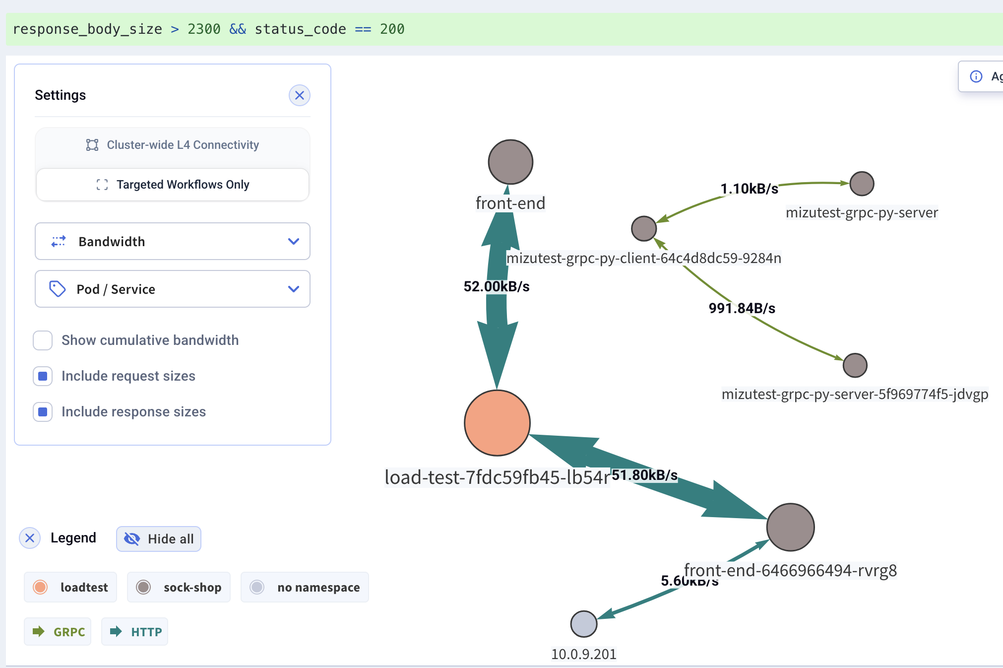
Workload Dependency Map
The Workload Dependency Map visualizes how workloads communicate — another way to view query results. It aggregates indexed API calls into a dependency graph showing protocols, bandwidth, and throughput between workloads.
Like everything in Kubeshark, the map is driven by KFL queries. It reflects the active traffic source (real-time or an indexed snapshot) filtered by the current KFL query. The map updates in real-time as traffic flows.
What It Shows
- Dependencies — which workloads communicate with each other
- Protocols — application-level protocols on each connection (HTTP, DNS, gRPC, Redis, Kafka), color-coded in the legend
- Bandwidth — data volume between workloads
- Throughput — packet rates between workloads
Display Options
Additional display options are available in the Settings dialog:
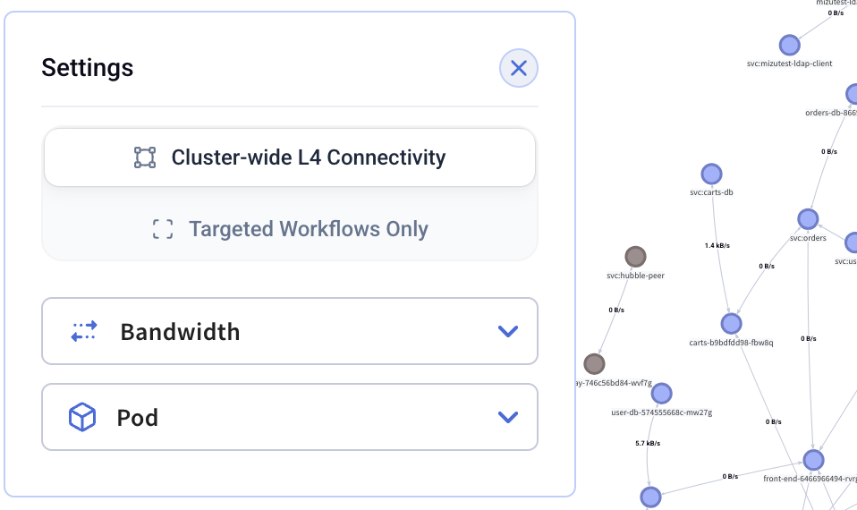
Grouping
The map can be grouped at different levels:
- Namespace — group workloads by namespace
- Node — group workloads by node
- Pod / Service — show individual workload-level connections
Bandwidth Options
- Bandwidth — toggle bandwidth metrics on connections
- Show cumulative bandwidth — display cumulative bandwidth instead of rate
- Include request sizes — include request sizes in bandwidth calculations
- Include response sizes — include response sizes in bandwidth calculations
Filtering
Dense clusters can yield cluttered maps. Focus on specific parts of the cluster by:
- Using KFL queries to filter traffic
- Using Legend Filters to show/hide specific namespaces or nodes